Customising Minimizable & Accordion Buttons
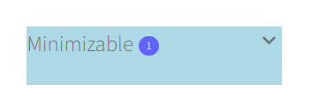
Customising Minimizable (Default Open, Default Closed) and Accordion Container Types.

Selectors
Main: .fww-widget-toggle
Descendants:
- .widget-title – Title text
- .selectedcount – Number of currently selected products
- .fwwicon-keyboard_arrow_down – Open / Close arrow
Full Background
Background colour and rounded corners.
.fww-widget-toggle {
background-color: lightblue;
border-radius: 10px;
}

Text
Text position centered, font size, and colour.
.fww-widget-toggle .widget-title {
color: black;
font-size: 30px;
text-align: center;
padding-bottom: 6px;
padding-top: 6px;
}

Selected Count
Increased circle and font size, centered and changed colours.
.fww-widget-toggle .selectedcount {
height: 30px;
width: 30px;
background-color: orange;
color: black;
font-size: 34px;
line-height: 28px;
}

Open / Close Arrow
Colour and size.
.fww-widget-toggle .fwwicon-keyboard_arrow_down {;
color: red;
font-size: 40px
}
Full Example

All CSS Used Above
.fww-widget-toggle {
background-color: lightblue;
border-radius: 10px;
}
.fww-widget-toggle .widget-title {
color: black;
font-size: 30px;
text-align: center;
padding-bottom: 6px;
padding-top: 6px;
}
.fww-widget-toggle .selectedcount {
height: 30px;
width: 30px;
background-color: orange;
color: black;
font-size: 34px;
line-height: 28px;
}
.fww-widget-toggle .fwwicon-keyboard_arrow_down {;
color: red;
font-size: 40px
}
