Customising Container Buttons
Customise each of the Container Buttons separately, starting with the selectors: .fwwcontainer.containername
Selectors
Main:
- .fwwcontainer.popout – Popout Button
- .fwwcontainer.popover – Popover Button
- .fwwcontainer.popoutgroup – Popout Group
- .fwwcontainer.popovergroup – Popover Group
Descendants:
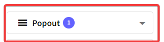
- .btn – Overall button

- .dashicons – Icon

- .fwwpopoutbuttontitle – Title

- .selectedcount – Selected amount

- .fwwicon-arrow_drop_down – Arrow

Quick Example
Main class + descendant:
.fwwcontainer.popout .btn {
background-color: lightgreen;
color:white;
}

Full Example – Including background/text colors, font/arrow sizes, and border ratios
Overall button:
.fwwcontainer.popout .btn {
background-color: lightgreen;
color:white;
}
Icon:
.fwwcontainer.popout .dashicons {
background-color: pink;
color: blue
}
Title:
.fwwcontainer.popout .fwwpopoutbuttontitle {
color: orange;
font-size: 30px
}
Selected Amount:
.fwwcontainer.popout .selectedcount {
background-color: red;
color: black;
}
Arrow:
.fwwcontainer.popout .fwwicon-arrow_drop_down {
color: white;
font-size: 50px
}

Full CSS used for example
.fwwcontainer.popout .btn {
background-color: lightgreen;
color:white;
border-radius: 10px;
margin: 10
}
.fwwcontainer.popout .dashicons {
background-color: pink;
color: blue
}
.fwwcontainer.popout .fwwpopoutbuttontitle {
color: orange;
font-size: 30px
}
.fwwcontainer.popout .selectedcount {
background-color: red;
color: black;
}
.fwwcontainer.popout .fwwicon-arrow_drop_down {
color: white;
font-size: 50px
}
