Customising Price Filter
proThe Super Speedy Price Filter has 5 display styles to pick from, Here, I will show you some examples of how to customise them further using CSS.
Slider Display Type
This option has three slider types to pick from, but the selector to change their appearance stays the same.

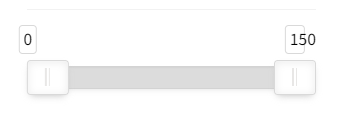
Default Slider

Rounded Slider

Square Slider
Selectors
To customise, pick the main selector and the descendant you want to change.
Main selector: .ssf_range_slider
Descendant Selectors:
- .noUi-connect – Slider area between the min and max selected prices.

- .noUi-connects – Slider area that displays underneath.

- .noUi-tooltip – Price blocks.

- .noUi-touch-area – Slider handles.

For example to make each of these different colours add this to your custom/additional CSS area
.ssf_range_slider .noUi-connect {
background-color: #1CB71F;
}

.ssf_range_slider .noUi-connects {
background-color: #ff0000
}

.ssf_range_slider .noUi-tooltip {
background-color: #FFA500;
color: #FFFFFF
}
I also change the text colour with color: #FFFFFF.
.ssf_range_slider .noUi-touch-area {
background-color: #A020F0;
}
All Slider CSS
These are the 4 selectors, properties, and values I used together, feel free to add more properties and adjust them to your liking.
.ssf_range_slider .noUi-connects {
background-color: #ff0000
}
.ssf_range_slider .noUi-connect {
background-color: #1CB71F;
}
.ssf_range_slider .noUi-tooltip {
background-color: #FFA500;
color: #ffffff
}
.ssf_range_slider .noUi-touch-area {
background-color: #A020F0;
}
Dropdown Display Type
A box that opens on click and displays the values assigned in the widget.

Selectors
Main selector: .ssf_range_content
Descendants Selectors
- select – The whole area including the dropdown

- select option – Only the dropdown

Customisation of the dropdown is limited. For better dropdown CSS, select Popout Button in the Display Container Type option in your widget.
.ssf_range_content select{
background-color: #FA8072;
color: #FFFFFF;
}
.widget select option {
background-color: #90EE90;
color: #000000;
}
All Dropdown CSS
The CSS used to change colours for the dropdown
.ssf_range_content select{
background-color: #FA8072;
color: #FFFFFF;
border-radius: 4px 4px 0px 0px
}
.widget select option {
background-color: #90EE90;
color: #000000;
}
Text Links Display Type
Simple text of the numbers assigned in the widget

Selectors
Main Selector: ssf_range_content
Descendant Selectors:
- ssf_range_link – targets the link area

- Anchor tag <a> – targets the link itself
Use the same properties as above to change colours, always. Change font size with:
.ssf_range_content .ssf_range_link a {
font-size: 20px;
}
Hover effect
Links usually have a hover effect, but they aren’t only used for links. Change the colour when you hover and even the font size to make it stand out:
.ssf_range_content .ssf_range_link :hover {
font-size: 30px;
color: red;
}

All Text Link CSS
Changed font size, colour and added a hover effect.
.ssf_range_content .ssf_range_link a {
font-size: 20px;
}
.ssf_range_content .ssf_range_link :hover {
font-size: 30px;
color: red;
}
Radio Display Type
Similar to Link Display or to a Checkbox Display but with Radio Buttons.

Selectors
Use the same as the Link Type above just add the .radio selector after the main selector:
.ssf_range_content .radio .ssf_range_link a {
font-size: 20px;
}
.ssf_range_content .radio .ssf_range_link :hover {
font-size: 30px;
color: red;
}

Button Colour
Change the button colour alone with this CSS:
.ssf_range_content ul.radio li a:before {
color: #FFA500;
}
Label Display Types
Button-shaped links allow the user to select the whole button.

Selectors
Main Selector: .ssf_range_content
Descendants:
- Unordered List <ul>
- .label
- List Item <li>
- Anchor tag <a>
Reminder: Properties and values stay the same throughout CSS so use the same ones to customise anything.
Changing button shapes
To make the edges less rounded
.ssf_range_content ul.label li a {
border-radius: 4px
}
Or use percentages to make them even more rounded:
.ssf_range_content ul.label li a {
border-radius: 50%
}

